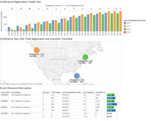
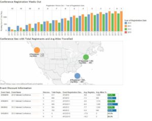
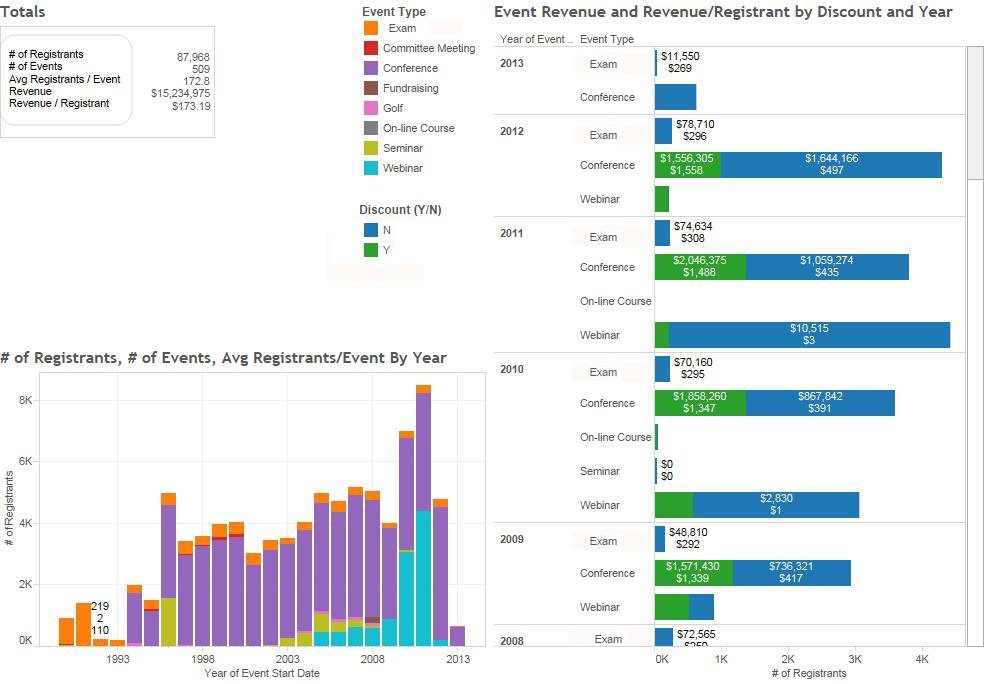
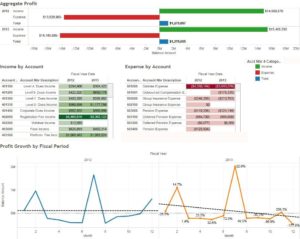
Many who are new to data analysis may think that creating a dashboard is complex and beyond their abilities, but that’s not true. With the advent of applications that enable the user to transform data into meaningful visualizations through the use of intuitive, drag and drop interfaces, association staff can take advantage of the power of dashboards as a business tool. Much like cell phones or tablets, a new generation of dashboards are becoming mainstream and revolutionizing the way we access information to gain insight into an association’s operations and performance. If you can drag and drop and aren’t afraid to experiment, you can uncover insightful information in your data through the use of dashboards. Below are some things to keep in mind when creating and implementing meaningful dashboards:
Strive for simplicity and focus. Only include visualizations that enable critical information to jump out to the user, who can then understand and act on it immediately. What is the key information that the person viewing the dashboard needs to know? What information are you trying to make more readily available and why? Be specific and only include what is necessary for its stated purpose. Everything else is clutter and distraction. Do not include non-essential text. The goal of the dashboard is to convey critical information at a glance.
Be clear. Make sure there is no ambiguity about what the information in your dashboard actually means. If the definition of a specific metric is subjective or difficult to understand, it may be interpreted differently by different people. Provide context for all quantitative values to ensure everyone is on the same page with what the dashboard is displaying. Give any background necessary to make sure the audience is clear on the relationships between the data being shown. Although real-estate on your dashboard is precious, include definitions and explanations for terms on your dashboard that may be open for misinterpretation. You can also provide a link that takes the user to additional information or examples (at DSK we call this the “Common Language Dictionary”).
Know your audience. Make sure your dashboard consists of data specifically targeted to a single audience. Often dashboards include a mix of data, some of which is relevant to one audience and some to another. The goal is to quickly provide information at a glance to enable better decision-making. A dashboard for the Membership team may include information about member engagement (including the ability to drill down and see which events each member has participated in), retention rates, and how their members are dispersed geographically. A dashboard for the Financial team may include financial metrics surrounding revenue, loss and overall budget.
Design dashboards to be interactive. Each user needs answers to questions based on what they are doing at the moment. Providing a static dashboard limits the effectiveness of the data in providing these answers, and ultimately renders the users helpless in finding the specific answers they need. This can cause frustration instead of empowerment. Data analysis and data discovery are meant to be techniques for users to explore and ask questions about the information they are seeing. For example, you may provide summary membership information by geographical region, but you also want to allow the user the ability to explore each country. The goal is to allow access to information at the speed of thought.
Location. Location. Location. Don’t place your logo or other non-essential information on the upper left-hand corner of your dashboard. The upper left quarter of the screen gets the most attention, according to the Eyetrack study performed by the Poynter Institute and should ideally be used for key information.
Provide detail. Make sure your dashboard allows users to look at the underlying data. Although the goal is a format that is easy to read and interpret, the user also needs to be able to delve deeper into the details of the information presented in tables and charts. It is important to be able to drill down to explore data of interest at a greater level to assist in answering questions and deriving more context.
Power to the people. Let everyone have access to dashboards. The culture where reporting and analysis is the domain of IT or upper management is quickly going away. In this Information Week article, Ellis Booker explains how organizations are moving towards self-service data discovery. For data to be useful, it should be available to everyone in a format that enables each person to better make decisions for the association. It is empowering to be able to go to a dashboard and pull up the answer to a question that came to you and that will improve a process you’re involved in. This is not only good for staff but it is good for the association and ultimately for its members. Think of the possibilities if everyone in your association is making data-guided decisions!
As data analysis and discovery become more mainstream, associations’ data-analytics priorities are being included within their strategic goals. More and more association leaders are quickly adopting and embracing the use of to make decisions. This is creating a culture that fosters communication between groups about data-sharing and amplifies the search for undiscovered opportunities. A key component in the implementation of successful data analysis by your association is to adopt and make use of interactive dashboards a part of your culture. Dashboards organize and present information in a format that is easy to read and interpret, and enable users to search for answers in your data. Use these ideas to guide you toward effective dashboards so they can become a powerful tool for your association.
